MyPerformance
1. Introduction
MyPerformance is a free business insights tool that shows you your most useful data. Dashboards help you visualise your transactions over time and pull out key metrics to quickly get you up to speed with your payments’ performance.
Watch the video below as Kate and Jordan provides explains the importance of using business intelligence to manage your payments.
With MyPerformance, you can:
- View your flows and conversion over time
- Immediately see key metrics
- Analyse how your average transaction value (basket size) affects payment performance
- Understand why transactions are rejected
- See the impact of 3-D Secure authentication on transactions
- Breakdown and compare the performance of your payment methods, entities (PSPIDs) and customer countries.
In this guide, we will walk through how to understand the different dashboards of MyPerformance and the various functionalities that you can perform on the tool.
Use this link to log onto MyPerformance.
| If you do not have an access yet, please contact our Sales department with this template. |
2. Hover for tooltips
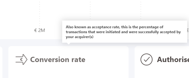
MyPerformance V2 uses tooltips to guide you through its features.
To learn more about a metric, chart or button, hover over the title to see an explanation. All charts have tooltips with individual data points. Hover over a bar, column or point on a line graph to see the specific metric and date if relevant.
3. Using filters
Filter the dashboards
Each dashboard will give you an overview of one aspect of your payment ecosystem. To dive deeper into a particular aspect of your transactions, use the filter pane on the right of the dashboard to customise the view.
- View the Payment Overview dashboard for a recently added payment method to see how it is performing, or select multiple countries to understand your performance in a certain geographical area.
- View the Average transaction value dashboard with one country at a time to understand how much different areas are spending throughout the year.
- View the Rejections Overview dashboard with your most popular payment method to see if it is experiencing a normal or high level of rejected transactions.
- View the 3-D Secure dashboard with only non-EU customer countries selected to see if 3-D Secure is affecting your conversion with customers who may not be aware of it.
- View the Accounts dashboard filtered by one group at a time, to easily compare the performance of the accounts within each group.
- View the Countries dashboard filtered by payment method to deep dive into how they perform in each country.
Filter panel
Within each dashboard, there is a filter panel on the left. Using the filter will allow you to customise the data in the dashboard.
Filter by date
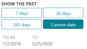
The filter panel offers three quick select date ranges: 7, 30 and 365 days. The default date range is 30 days. If you would like to customise your date range, click on Custom date and select your desired dates. If you would like to remove your filters and return the data selection to 30 days, click clear filters on the top right of the filter panel.
Filter by payment methods
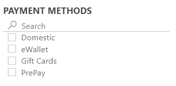
Select one or more payment methods to show only transactions that used that method. To select multiple, hold down Control/Cmd as you select. If after you select a payment method there is no data showing on the dashboard, this means that no transactions were processed using that payment method during the time period you have selected. To compare payment methods against one another, use the Payment Methods dashboard in the Payments section.
Filter by groups and accounts
If you have multiple business entities within your Worldline account, you can use the groups and account filters.
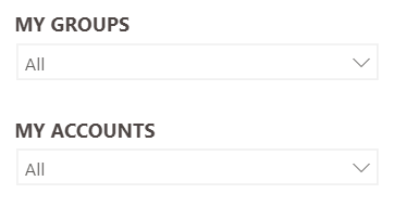
If you have more than one Worldline account (also known as a PSPID), use the accounts drop down to select one or more account. To select multiple, hold down Control/Cmd as you select. If you have more than one group of accounts with Worldline, you can select more than one of these from the drop down. When you filter by a group, you will then only be able to filter by the accounts within that group. To once again see all of your accounts, deselect that group or use the clear filters button to remove all filters.
Set default filters
MyPerformance allows you to define default filters. They remain as fixed settings between login sessions.
This will save you time organising data between sessions.
Filter by default time zone
Our tool bases your KPI on transactions processed within a specific period.
Select all transactions from the time zone that is the most relevant for your business.
Filter by default currency
Display transactions that were processed with the most relevant currency for your business.
4. Navigate dashboards
Payment overview dashboard
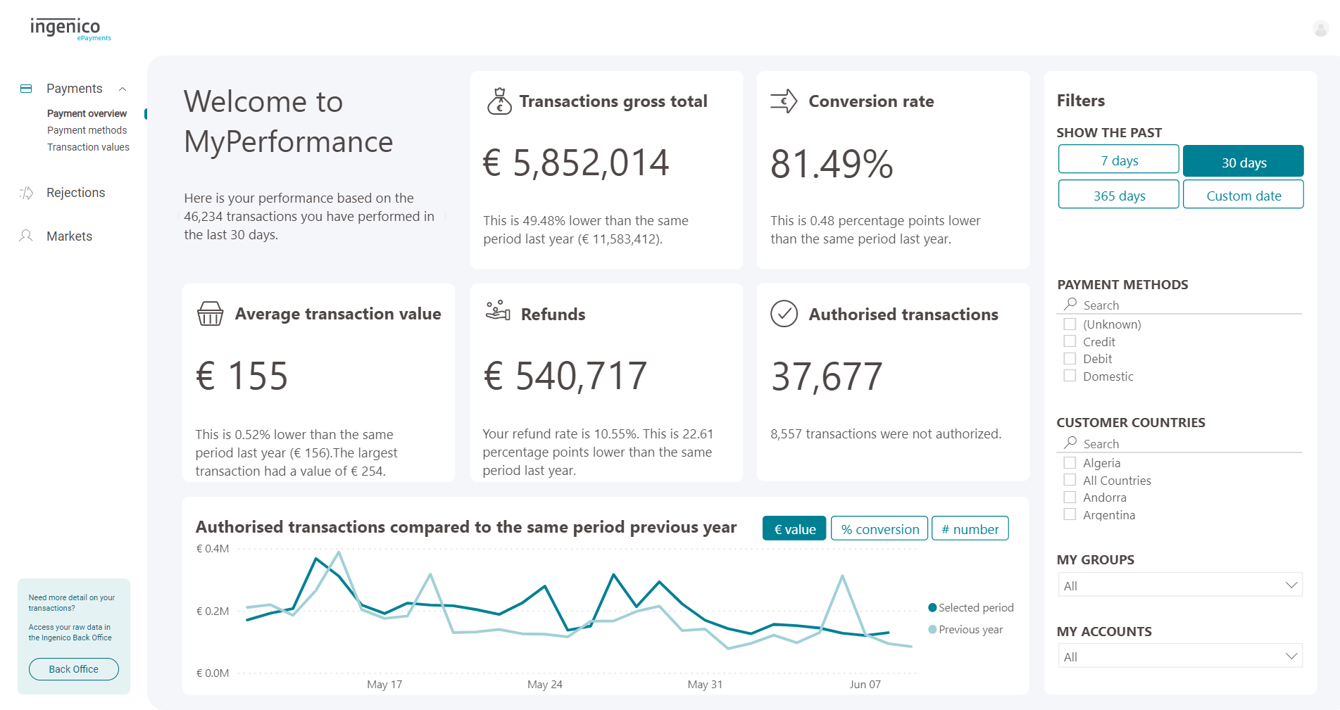
The payment overview dashboard is the homepage of MyPerformance V2. It gives a high-level view of the most important payment metrics such as your conversation rate, refunds, gross total and number of transactions. It also shows your average transaction value which is the average amount that your customers spend in one transaction.
As a rule of thumb,
-
- Conversion rate is number of transactions authorised / number of transactions initiated
- Rejection rate is number of transactions terminated / number of transactions initiated
- Abandoned rate is number of transactions not started correctly / number of transactions initiated
Conversion rate + Rejection rate + Abandon rate = 100%
Authorised transactions comparison

It also includes a chart showing your transaction flow over time. Use the three value control buttons to toggle between viewing the value of total authorised transactions in euros, conversion rate and number of authorised transactions. This helps to give a more contextual view of your sales as well as your payment performance.
Payment methods dashboard
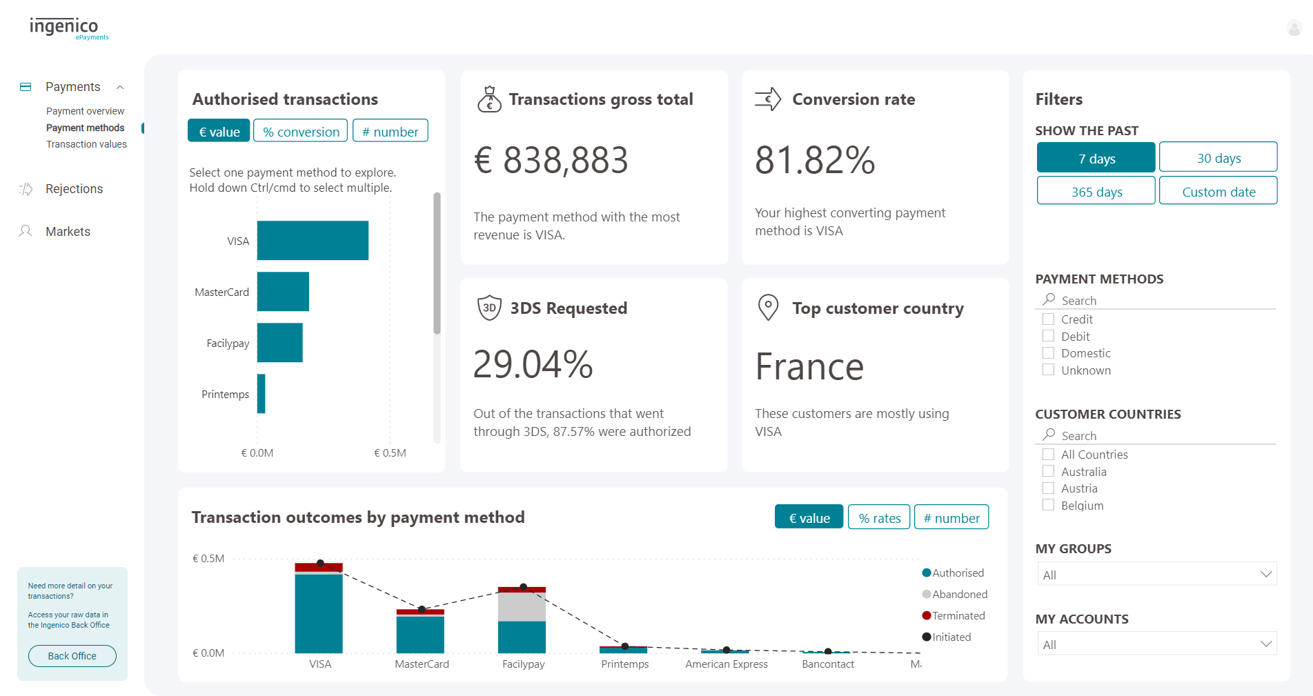
The payment methods dashboard gives you a better understanding of the performance of your payment methods. You can evaluate whether you have the right payment methods for your customers and whether your integration is working properly.
Authorised transactions
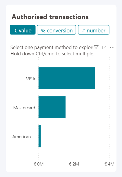
The authorised transactions chart shows you how many successful transactions have went through each payment method as well as the conversion rate. Selecting one of the payment methods in this chart will also update the other metrics on the dashboard.
Transaction values dashboard
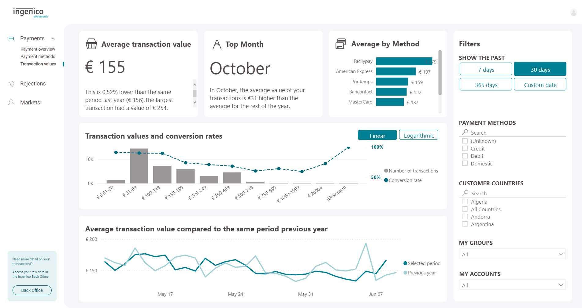
The transaction values dashboard illustrates trends in average transaction value (ATV) such as the month in which customers spend the most per transaction and ATV per payment method.
Average transaction value (ATV) is a way to measure how much customers spend per transaction. It is sometimes known as ticket size or basket size. Finding ways to increase your average transaction value can be a way to increase your revenue from your existing customers. However, higher transaction totals can also lead to poor conversion. Customers may find they have insufficient funds, they may hit a limit on their card or account or they may have to authenticate them self with multiple forms of identification and fail one of the steps. Understanding how average transaction value impacts your business can help you make smarter packaging decisions or help your customers have a smoother check out experience.
Transaction values and conversion rates chart
The transaction values and conversion rates chart displays how many transactions fall in each group of ATVs and the conversion rate of each group. This illustrates which basket sizes are the most popular and what impact it has on conversion. Toggling between the linear view and logarithmic view will show the same data but on different scales. If there is a big difference between your highest and lowest value, the Logarithmic view adjust the scale to make it easier to compare values.
Average transaction comparison

The line chart compares the ATV of each day of the selected time period to the same period in the previous year. Please note that this will compare the same date, rather than the same day, of the previous year. For example, if you typically have more sales over the weekend, these peaks will appear on different areas of the graph.
Rejections overview dashboard
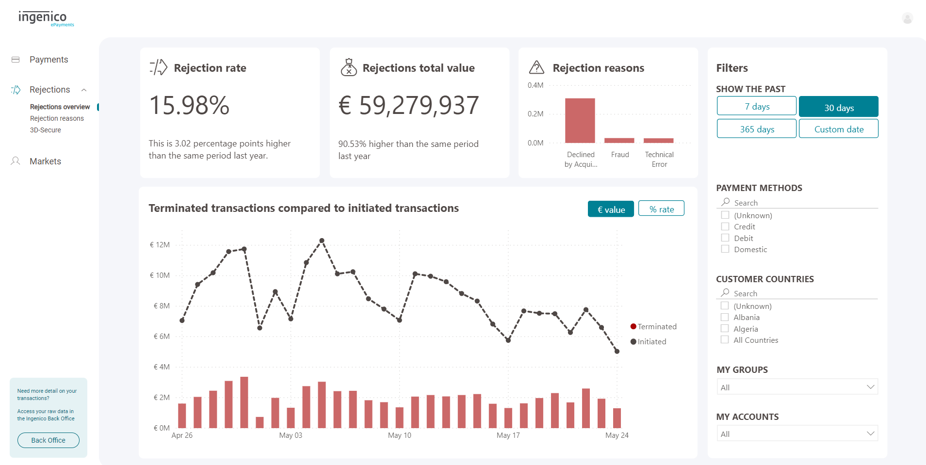
The rejections overview dashboard gives you an summary of the transactions that were not authorised for payment. This shows you a health check of whether your rejected transactions are at a normal level for your business.
Rejection reasons
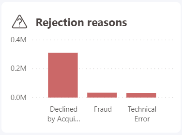
It also shows you the three main categories for rejected transactions:
- Declined by acquirer: Transactions that were not accepted by the aquirer
- Technical error: A fault at one point in the transaction process
- Fraud: Transactions that were blocked because your fraud prevention tool flagged them as being likely to be fraudulent and stopped them. Rejections under the Fraud category can be seen as a positive form of rejection as these reflect how many possible fraud incidents were prevented. However, if you are seeing a disproportionately high number of fraud rejections, it could mean that your fraud prevention settings are too strict and are blocking legitimate transactions.
To learn more about which fraud prevention rules are triggering the most rejections, use the Rejection reasons dashboard. To learn more about fraud prevention, visit the guide.
Rejection reasons dashboard
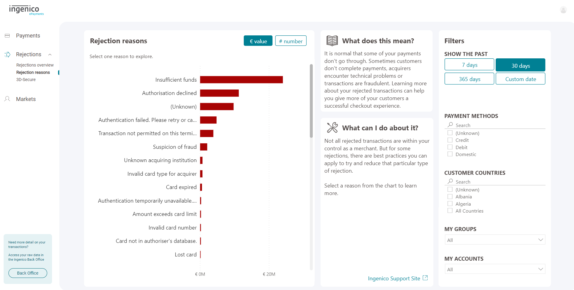
The rejection reasons dashboard breaks down all of your transactions that were confirmed by the customer but not successfully accepted by your acquirer(s). This dashboard shows you the error code that was provided along with the rejected transaction and lets you rank these errors by which are causing the highest value or number of rejections. Some of these errors that have been provided are intentionally vague (to avoid sharing information with fraudsters) or will be out of your control as a merchant. But some rejection reasons can reveal opportunities to improve your payment page experience, technical integration, payment setup, fraud settings and more. These can lead to an increase in overall conversion.
Selecting a specific reason in the chart will generate a brief explanation as well as tips on how to reduce that rejection. If you come across a less common rejection reason, there might not be a specific explanation provided. Refer to our guide on payment best practices for some general tips on how to improve your conversion. For more specific information, it is likely that your rejections relate to one of the following topics:
- Optimise your payment page
- Offer the right payment methods
- Prevent fraud
- Learn more about integration
- Understand 3D-Secure basics
To analyse which transactions connect to which reasons (known as NC Errors), visit the Back Office. Learn more in the FAQ.
3-D Secure (3DS) dashboard
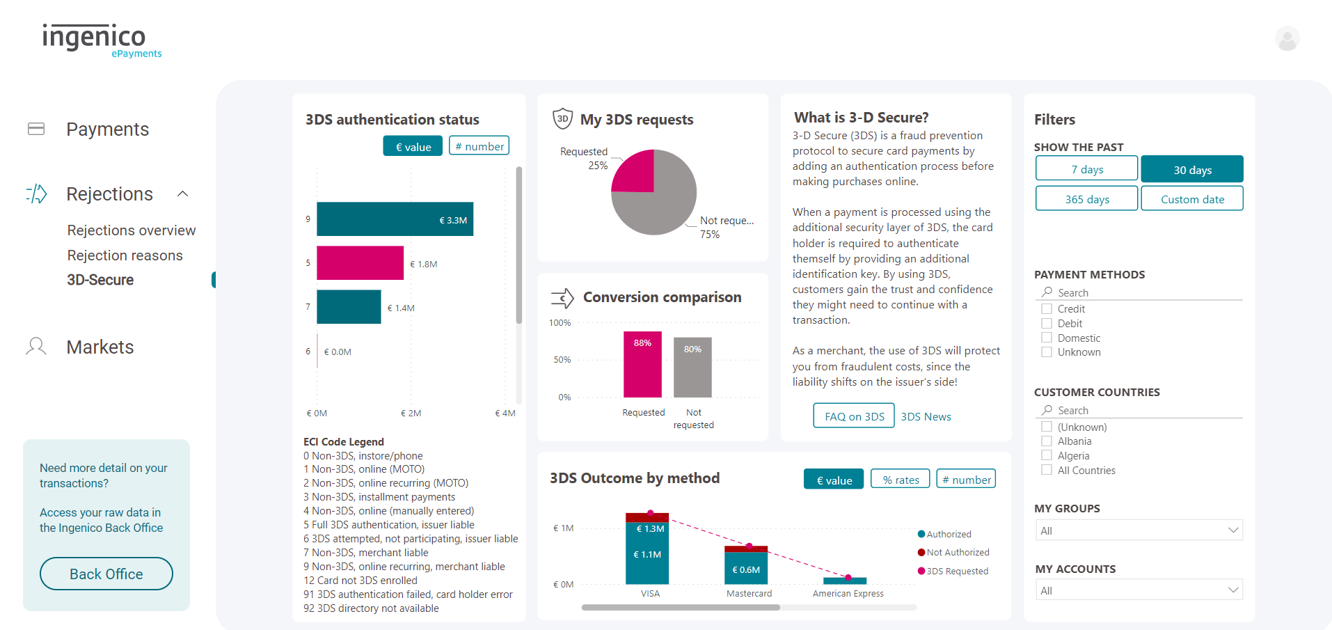
This 3DS dashboards provides you more information about your transactions that go through 3-D Secure strong customer authentication. This means that in order to successfully authorise these transactions, the customers had to verify their identity to ensure the transactions were not fraudulent.
3DS requests and conversion comparison
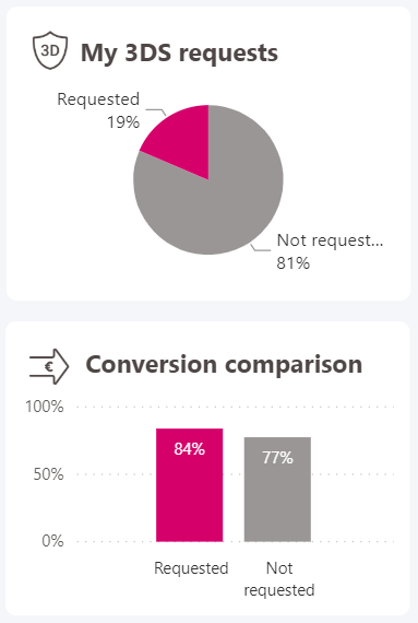
For a quick health check of your 3-D Secure transactions, check the 3DS Requests and Conversion comparison charts.
- My 3DS requests shows you how many of your initiated transactions were required to be 3DS authenticated.
- The Conversion comparison chart shows the conversion rate of your transactions that were 3DS authenticated (left) and transactions that did not have to be 3DS authenticated. It is possible that your 3DS requested transactions have a lower conversion rate. This might be because customers may have additional step to carry out and abandon or fail authentication. It could also be that there is a technical error with your 3DS integration prevented some transactions from going through. Or, it could also be attributed to fraud attempts being prevented. However, due to the increased usage of 3DS, you may notice that your 3DS requested transactions actually convert better.
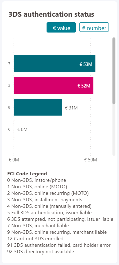
3DS authentication status
To learn more about what actually happens to your transactions in relation to 3DS, use the 3DS authentication status chart. This shows you the 3DS specific status for all of your transactions. This is known as the Electronic Commerce Indicator (ECI). It shows you if the transaction was 3DS authenticated or not, what kind of payment it was and whether it passed 3DS authentication.
Accounts dashboard
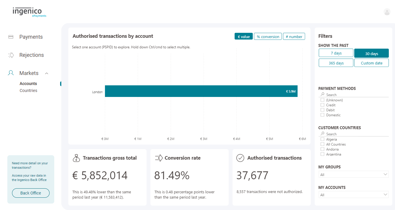
The accounts dashboard helps you compare your Worldline accounts (also knows as PSPIDs). Use the value control buttons at the top right of the chart to compare the amount of authorised transactions processed by each of your accounts in terms of gross value, conversion rate and number of transactions. As you select each account, it will also update the key metrics.
This dashboard also provides you with a better understanding of how your business areas compare with each other. This can help you understand how different segments or areas of your business stack up, but it can also be used for A-B testing. By making a change with one account and then selecting the relevant time period, you can start to draw conclusions on the impact of your decisions.
Customer countries dashboard
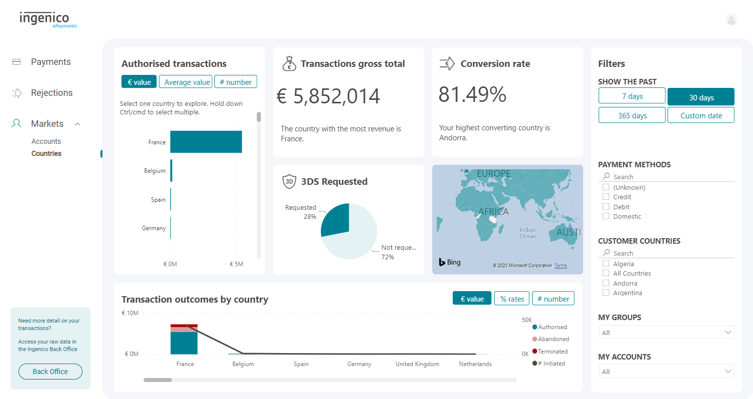
The customer countries dashboard compares the countries of your customers, based on the country that issued their card, or based on their IP address where card country is not available. Understanding your performance based on country is useful in adding context to your performance evaluation. It is also an important tool when making decisions about your set-up.
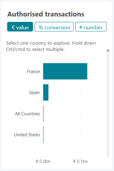
Authorised transactions
For an overview of your countries, use the Authorised transactions chart to compare your countries by gross value, average transaction value (also known as basket size) and number of transactions. You can also use this chart to filter the whole dashboard by a certain country.
Transaction outcomes by country

To understand what is specifically happening to the transaction lifecycle with each customer country, use the transaction outcomes chart. If you have a particularly high number of rejections in one country, you should refer to the Rejection reasons dashboard and filter by that country to find out why. If you have a high number of abandonments in a country, you should make sure you have the local payment method for that country.
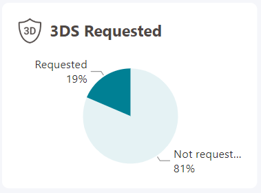
3DS requested
Use the 3DS Requested chart to compare how many transactions must be authenticated using 3-D Secure in each country. If no country is selected, this will reflect your overall numbers. Select a country from one of the charts to update these percentages. If you notice any unusual numbers for a certain country, you should refer to the 3-D Secure dashboard and filter by that country.
5. Disclaimer
Worldline shall not be responsible for any inaccurate or incomplete information. The information contained herein is provided as a courtesy and is for general informational purposes only. This information is not intended to be a complete description of all applicable rules, policies and procedures. The matters referenced are subject to change from time to time, and individual circumstances may vary. Worldline assumes no responsibility or liability for any errors or omissions in the content of MyPerformance. Worldline shall also not be responsible for any damages that are caused by MyPerformance. Worldline makes no warranties or representations about the use or operation of MyPerformance. Neither Worldline nor any of its affiliates shall be liable for any costs, losses and/or damages arising out of access to or use of the MyPerformance.
